My Music magazine: (draft)
Front Cover: Draft
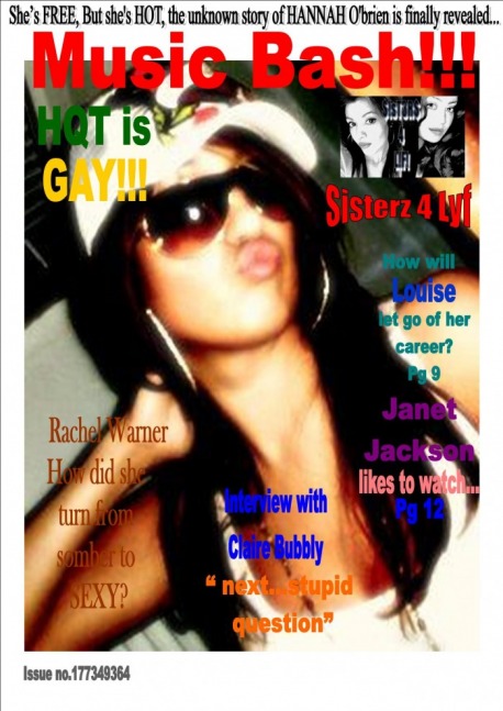
For my front cover i took a close up shot of a freind, and gave her a hip hop look. This was seen through her wearing sunglasess, hoops and a hat. Her having her lips to a side gave her a funky and stush look. I added side heading which i thought would attract teenage customer attension by what i felt they would be interested in. I felt that this picture had more of a professional look and teenagers would buy it. I then minipulated another picture to give it a look of a album ' sisterz 4 lyf '.
Content: Draft
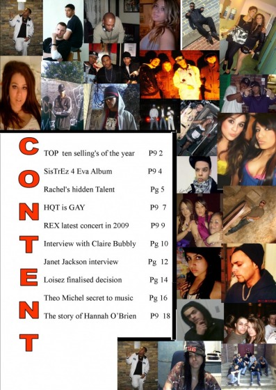
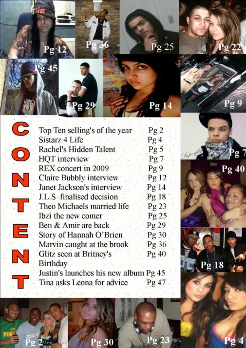
For my content page i took pictures of freinds from all types of angles which gave it an amusing and interesting look. I felt that by me adding pictures all around would give the readers (teenagers) a breif idea of what the magazine is about. I used the colour red for the content title so it would stand out and make it look more organised. I wrote the information in the middle so it gave a more clear understanding.
Double page spread: Draft
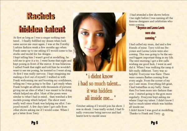
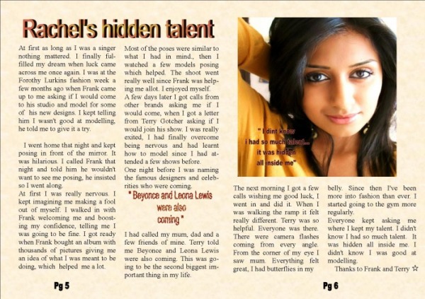
For my doublepage spread i took a picture of a freind in a close up shot. I wanted her to have a simple and stylish look since it was about her turning 'sexy'. I used a orangish and yelowish tone to the page, matching her top. I used the background and font the same colour so it would give a profesional and stylish look.
Evaluation of Assignment: Draft
1) What did you do to prepare for the assignment?
For my music magazine I looked through other magazines to see their layout, and analyze how they’ve made it look professional and attractive to customers. I took pictures and manipulated them to by using Photoshop to give them a professional effect.
2) What genre was your magazine and how did this and how did this affect the choices
you made?
The genre of my magazine ‘Hip Hop’. This was shown by the use of bold dark and outstanding text which was eye-catching and revealing to the audience. E.g. red on top of the black and purple on top of the colour cream. The picture also sent across the message that it was a hip hop magazine.
3) What choices did you make:
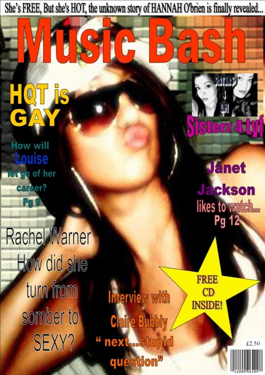
Picture: For the front cover I used 1 picture which a medium shot and added affects. I stretched the picture to cover the whole page so it looked professional.
For the content page I added 15 pictures so it gave the customers a brief idea of what was inside the magazine. I took pictures from different angles, e.g. close up, long, high angle, and low shot. I then added affects to most of them so they were appealing to the customers.
For the double spread I used 1 picture, which did not have any affects on it and was a n close up shot.
Colours: I used colours such as yellow, bright purple, shocking pink and used the colour red for the head title so it was eye-catching.
For the content I didn’t use any colours due to it having a variety of different colours on the pictures.
For the double spread I used one colour theme. I used the colours orange, beige and cream since the picture was mostly orange.
Content: For the content page I used pictures and write, giving information on what was inside in the rest of the magazine to give the customers an idea of what was inside.
Font: For the font I used different sizes of text. I used large sizes for the head titles and small so that the important and main information was outstanding to the customers.
4) Did you change anything and why?
After completing my magazine as a class we analyzed and commented on each others magazine so we could see where we were wrong and improve it later, so this helped be create my magazine to a high standard. Then I changed the layout added a few more writing and added affects to more of my pictures.
5) Is your magazine successful?
From my opinion I personally think I have tried my level best but if I had another chance to improve then I would try to reach the standard of a professional magazine.
Front Cover:
I improved my front cover because i felt that it didnt look like a magazine i would see in a shop, so i covered the image on the whole page because the magazines i had analysed had one image that covered the whole page. I added the price and a bar code so it looked like what a normal professional magazine looked like and added a bright yellow star saying "Free CD inside". I felt this would attract more customers to buy it making them feel its worth them buying it.
Content:
I Improved my content page because i felt it wasnt clear enough for the readers. For my contents page i removed a lot of images because i felt that it was too cramped. From 25 pictures i kept 15. I also added numbers to each picture so the audience know clearly what page had what and added more writing and pages to the content. From 18 pages i added 29 pages more.
For this picture i added a blury background, but didnt add it onto my contents page since my publisher wasnt working at home and day after was the final deadline.
Doublepage Spread
I improved my double page spread because it was layed out wrong. i felt that my first one was better but due to the crease being in the middle on the magazine the text would get creased so the readers wouldnt be able to read it, so i changed the layout.
Evaluation
In what ways does your media product use, develop or challenge forms and conventions of real media products?
In order to present my magazine a professional way I had to analyse and look into other well-known magazines so I could work on the aspects which would help my magazine reach a higher standard. I realised in most magazines there’s a close up or long shot for the images used for front cover. I also noticed the colour red was used which made it eye catching.
For my magazine I used Adobe Photoshop to manipulate, add affects to my pictures so it gave a professional look to my hip hop magazine.
To make my magazine look similar to the professional hip hop magazine I had to make sure what pictures I used, the different fonts I used and colours I added.
The two magazines I focused on was ‘clash’ and ‘Q (Britain’s biggest music magazine)’ since I found them more appealing. I looked at how they were layed out, what kind of pictures were used and fonts. I liked the way ‘clash’ used a close up shot for the front cover so I took a close up shot for my front cover which covered the whole page. The conventions seen in a professional magazine were all seen in my magazine. Bright fonts, eye catching colours, quotes, subheadings and images were all seen in my magazine to make it look professional.
How does your media product represent particular social group?
My music magazine was mainly targeted at 17-19 year olds, teenagers and young adults, female and males. This was because I felt that more than adults teenagers are interested in hip-hop. The use of fast beats and raps is mainly liked by teenagers.
What kind of media institution might distribute your media product?
The genre of my music magazine was hip hop. I obtained most of my ideas by looking through other hip hop magazines. They were all professional music magazine companies in the UK such as ‘Hello’. This helped my magazine reach a professional standard. It made my magazine look more attractive and would draw more customers to read it, so therefore would have to purchase it.
How did you attract your audience?
I tried my best to catch attention of customers. One of the ways I did this was by choosing the colour red for my headline. I felt that the colour red would definitely catch customers attention since the font was set bold and colour was eye catching and quotes of celebrities would also attract customers.
I added a bright yellow star on a dark background saying ‘free CD inside’. I felt that this would tempt the customers to buy it making them feel its worth them buying it.
I used all these technique conventions so that my magazine would look appealing and attractive to customers which would tempt them to purchase it.
What have you learnt about technologies from the processes of consulting this product?
Throughout this coursework I have learnt a lot. One of the problems I had during this coursework was using Adobe Photoshop. I found it difficult to manipulate an add affects to my pictures which prevented me from adding affects to all my pictures. The second problem I had during this coursework was the work I created at home was different in college on the day of deadline so I had to change the fonts, layout and colours. I also learnt that while using a computer, it required a lot and time. I had a problem using the weebly site, while uploading it took allot of time uploading images and sometimes would crash which meant restarting again which wasted a lot of time. The main issue was keeping everything real, which meant that I had to create everything myself.
Looking back at your preliminary task, what do you feel you have learnt in the progression from it to the full product?
During the course of my assignment I tried my level best. I have now learnt how important it was for me to update my weebly and work. When I was given the work I felt it was going to be fun, 10-15 minutes job and would not require much effort. When I first handed in my draft I was satisfied with my work and felt I did a great job but sadly hadn’t. I got feedback from the teacher and the class which helped me allot, with little mistakes I was loosing marks with.
Audience view on my Music Magazine
Amna said what she found most interesting was the double page spread. She liked the way the interview was written and the colour theme to it
Kiran said she liked the way I had my contents page, the layout and the pictures. She liked the way I had the pictures all next to each other and around the page.
Fozia said she liked the way I had the front cover layed out. The colours of the subheadings, the main picture and the little new album picture of ‘sisterz 4 lyf’.
